Online Course Development
By Chris Groenhout
|
In developing a website I believe that it is critical to view it from a student’s perspective. Having taken many courses online has given me a strong student perspective on what works and what does not. Streamlining the user experience while making expectations and progress transparent have helped my course tremendously.
At first, I just created a site and put links to all the course resources that I had either in a word document or online. The problem with this was that the students were left in a forest without a compass. Students that went to the site got lost and did not return. The site was underutilized and all the effort that went into creating the site felt like a waste of time. |
|
In order to fix this problem, I added a number of features to address these issues.
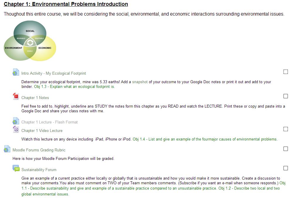
- Adding a clear chapter number and title to provide context and easy reference.
- Adding an image to relate to visual learners.
- Providing and introduction activity to provide context.
- Providing notes in a PDF format so all students can access them.
- Recording the chapter lecture for student to watch at any time.
- Including discussion forums to promote thoughtful discussions on course topics.
- Using the activity completion option in Moodle to either have the activity box check itself after the student has completed the activity or allow the student to check the box themselves.
- Including a table of contents for easy navigation of the site.
The majority of these ideas came from my experience as a student myself. Sometimes from seeing things that work well and often by being critical of how information was being presented and coming up with ways to make it more user friendly. I appreciate images and video so I wanted to be sure to include it on my site. Simple things like overdoing it on hyperlinks also helps. If I mention another part of my site or something online I make sure I hyperlink it. It only takes a second and makes the user experience that much easier. Frequent hyperlinking is just one example of how I try to “stay in the user’s head” when I am adding content to my site. Through my experiences and a new mentality, my site has become much more user friendly. Having used a nationally recognized rubric to improve my site provided a guide for me to critically analyze my site and systematically make improvements. I now feel comfortable sharing this site with others as an example of a well thought out website and invite ideas for further development.
For further insight on the development of this course please see my Developers Notebook.
